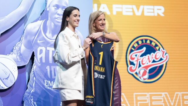
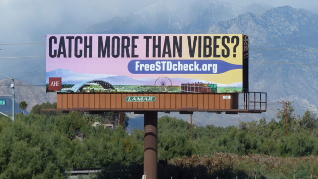
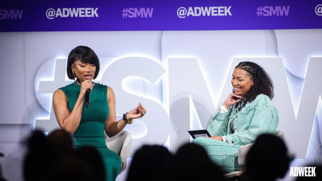
E-commerce Link: The Rise of Flat Design
With the recent unveiling of iOS7, Apple appears to be taking a bold move away from its previous interface design aesthetic. The new OS abandons the traditionally skeuomorphic look and feel in favor of a distinctively flat design.
Microsoft has been forwarding flat design in its Xbox 360 dashboards, the Windows 8 OS and even in the recent conversion of Hotmail to Outlook.
Google also has been moving to a similar interface style with its Android OS and Web-based applications. Apple's move to a flat design means the trend is continuing and still growing. But what is flat design and what does it mean for usability?
Skeuomorphic and Flat Design
Skeuomorphic design is when an interface emulates 3D objects. This emulation can happen very subtly through the use of drop shadows, bevels and gradients. Or it can be very overt, like Apple's Notes app where the entire interface resembles a notepad. The thought behind this type of design is if you present users with a familiar design from real life, they will be better able to understand how to interact with it.
There are problems with this idea, though. The digital world doesn't actually work like the real world. In the Notes app, because information is typed onto the screen, why do there need to be lines on the interface? These visual metaphors can become a distraction for the user and take up valuable screen real estate.
Flat designs take a distinctively more minimalist approach to how content and functionality are presented. Rather then using visual metaphors and embellishment, these designs rely on foundational elements like shape, color and typography to convey meaning.
As a minimalist style, any unnecessary design elements are avoided. This means layouts are often simple and uncluttered; only the most important or relevant content and functionality is presented to the user. Designers will often make heavy use of iconography for functional elements or navigation. This condenses information into a visually appealing form, which allows designers to place more functionality on the screen without the visual noise.
Because flat designs attempt to remove any extraneous design elements, what is left on the page grows in importance. Shape, color and typography often take center stage. The shapes of things like buttons or icons typically tend toward simple geometric shapes like rectangles, squares and circles. Sometimes corners are rounded, but bevels and gradients are often missing. In its purest form, even drop shadows are missing from flat designs; however, they are sometimes used to provide more visual interest or prominence.
Color plays a strong role in flat designs. Typically, colors are brighter, bolder and more numerous than in typical interfaces. This creates striking contrast between different elements in the interface and can be used to indicate functionality and draw focus. Buttons will often be consistently the same color and will stand in strong contrast to the rest of the page. It is through this consistency and contrast that users quickly understand the relationship between the color and functionality.
With the removal of other decorative elements, typography becomes a major element for conveying the interface's style and mood. Decorative and custom fonts for logos and headlines can set a very definite tone. Much like other shapes in flat design, fonts without added dimensionality, gradients, drop shadows or outlines are used. Type also is generally presented at a larger point size and with more spacing around it. This allows the type to have a greater presence within the design.
Benefits and Drawbacks of Flat Design
The use of these design principles does offer some potential user experience benefits and drawbacks. As fewer elements compete for attention, users are able to quickly scan and find what they need more quickly. This also helps limit the information and choices presented to users, allowing them to explore the site without being overwhelmed by information. Clean, brightly colored buttons highlight calls to action, encouraging deeper engagement with your interface.
Careful consideration and testing should go into determining the content and functionality hierarchy for flat designs. A beautiful flat design interface that does not meet the needs of its users will leave them frustrated and with a negative experience.
Elements like icons can definitely streamline an interface, but they can also quickly become a source of frustration. Using new or unfamiliar icons can cause confusion with users as they try to interpret the meaning. Staying close to established iconographic conventions would help promote understanding. If new icons are desired, it's best to test them with a wide range of users to confirm their meaning is understood.
Flat designs work well for responsive sites. Highly skeuomorphic designs can have difficulty adapting to changing screen sizes. Sometimes there can be unforeseen distortions in design elements due to aspect ratio changes and text wrapping. The minimal geometric nature of flat designs allows them to easily adapt to various screen sizes.
It is for this reason that Zurb uses flat design in its Foundation HTML responsive prototyping tools (foundation.zurb.com). Websites that use flat design also tend to have less data to load within a browser. This means load times can be faster, especially on mobile devices. This is important, as load times are a major source of frustration for users browsing via mobile.
The Future
While it can be argued that flat design is just another trend in Web design, there are some real benefits to adopting it for your interface. As interface design continues to evolve, users are becoming increasingly familiar with digital interfaces and require fewer connections to real-world metaphors to understand how to interact with them. Flat designs are a way to leverage that growing understanding in a way that provides a cleaner, more succinct experience over a wide range of devices.
Steve Johnson is a user experience designer at Chicago-based interactive agency Designkitchen. He also is a colleague of regular E-commerce Link columnist Cristin Siegel. Reach him at steve.johnson@designkitchen.com.
- Companies:
- Microsoft Corp.
- People:
- Steve Johnson

Steve Johnson, president and CEO of Copresco in Carol Stream, Ill., is an executive with 40 years of experience in the graphic arts. He founded Copresco, a pioneer in digital printing technology and on-demand printing, in 1987. Email steve@copresco.com or visit www.copresco.com