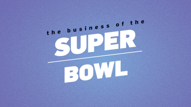
E-Commerce Link: Better Conversion
Four ideas for improving your Web site
September 2007 By Jeffrey Eisenberg
Are you testing landing pages like a primate on steroids? Are you spinning wheels trying to unearth your next conversion rate boost? Here are four Web site areas that often are overlooked and misunderstood, and some suggestions on how you can improve them for better site conversion.
1. Create a Better Perception of Site Speed
Load time is not the only element that affects a visitor’s impression of how quickly your site and each subsequent page appear on-screen. While a site loads with an absolute speed, it’s possible to give the impression it’s loading faster by prioritizing your information and loading critical details first.
Actual speed and the perception of that speed often are inversely related. The real influences are the user’s experiences and his ability to complete the tasks he came to accomplish. For example, forms that appear long—even though they may not request a good deal of information—often are perceived as requiring a long time to complete. If all the text-entry boxes on your forms are the same size, one simple thing you can do to create the perception of speed is reduce the box sizes to better reflect the data they’re collecting. For instance, your ZIP code box should be significantly shorter than your address box.
In general, the longer the visitor perceives it will take her to accomplish her task, the more frustrated and disinterested she will become.
2. Create “Contact Us” Pages that Work for Your Visitors
Many companies do a great job of listing all of their various contact names, numbers and corresponding departments, but offer very little guidance on which contact option is the best, or even correct, choice.
If you have several departments, be sure to put the information in the context of what the visitor needs. For example, instead of listing the finance department with its contact details underneath, lead with a header like “Questions about your application or financing? Call our finance department at (555) 555-5555.”
And please don’t hide your contact information. This information should be listed above the fold. Controlling call center costs is an important metric for many large companies, but the answer isn’t to hide contact information. While doing so may eliminate many knucklehead calls, it also leaves you vulnerable to frustrated and angry customers. This can waste even more time when they do hunt you down. It also robs you of an opportunity to win over customers by being more approachable. It’s hard to trust a company that doesn’t seem to want to talk to you. Remember, conversion-rate optimization is not simply for transactions or leads; it also can be used post-sale in customer relationship situations in which a conversion can be measured as a success.


Hitting the Email Inbox
The Ultimate Guide to Email Marketing